The concept of minimalism has grown and been adapted over the years. It is no longer merely a lifestyle; it has crossed over into business as well. Companies use the principle of minimalism to streamline their operations and boost productivity. Not only that, certain business sectors make use of minimalism for their image.
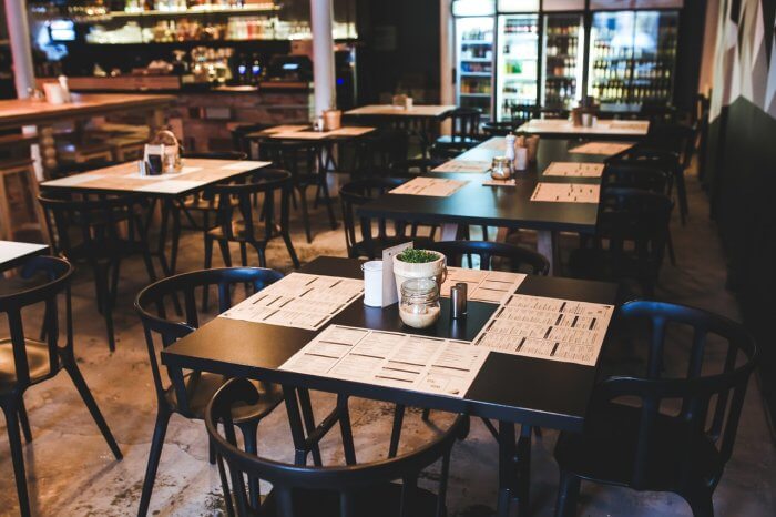
Take restaurants, for example. You will notice that a lot of modern high-end dining establishments have a noticeable preference for minimalist designs. From the interiors to the menus, you instantly get the impression that, for them, “less is more.” But why?
Young restaurateurs share that implementing minimalism, especially for their menus, is a fantastic strategy for their brand and operations.
Reasons to Choose a Minimalist Style for Menus
1. It creates the impression that the restaurant knows its strengths and focuses on these.
One of the qualities of high-end restaurants that truly sets them apart from other dining establishments is their confidence in their offerings. They know what they are the best when it comes to providing their customers with an excellent dining experience, and that is enough. They do not aspire to be anything else than what they intrinsically are.
Therefore, they maintain a focused selection of consistently winning items, which customers specifically come to the restaurant.
A simple look is a classic look. There’s no need to try too hard to please with excessive ornamental details which tend to be quite visually overwhelming. Minimalist menu designs focus on the high-quality presentation of necessary details, which is why it’s a must to turn to expert restaurant menu printing services for the creation of your menu.
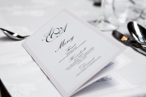
There’s just no arguing that a menu with gold or silver lettering and a few embossed details is always more elegant and can transcend time and trends than one with a variety of graphic elements.
3. It’s more helpful to customers.
As mentioned earlier, the minimalist design for a restaurant menu does not overwhelm the customers’ senses. The smaller selection and fewer decorative components allow them to make choices more quickly.
At the same time, when a menu is minimalistic, it creates the opportunity for better interaction with the restaurant. Customers turn to their servers more and ask questions for a better understanding of what certain offerings are about.
Such a connection is highly beneficial for restaurants because it’s another avenue for showcasing the higher level of panache they possess when it comes to customer service.
Style consistency is a must for classy restaurants. This quality is simpler to uphold when you opt for minimalist menu design. All you need to do is pick out a dominant element of your restaurant’s interior style and incorporate it into your menu design.
This design tactic is a simple way to establish uniformity for the business, and it is even applicable to interactive digital restaurant menus.
You can create a classy menu for daily use that your restaurant doesn’t have to replace for a long time if you opt for a minimalist design. It’s also a chance to choose fancier and more stylish implements without raising the cost of printing too much. For example, you can go for liquid metal printing on velvet paper.
The minimalist design can make up for the cost of specialty printing. Also, you may find that the printing service provider’s price is still more affordable than more graphic-heavy and colorful menu designs.
Ideas for Minimalist Menus
Now that you know why so many classy restaurants opt for minimalist menus, how about some ideas for creating a standout minimalistic style for your restaurant menu? Here are four ideas to consider:
1. Glossy or metallic printing
High gloss and shine never fail to create an elegant appeal. So, if you are working with a simple design for your restaurant menu, the best way to provide it with a high-quality vibe is by choosing glossy or metallic printing.
This single design difference is often all it takes to make your menu so much classier.
2. Handmade paper
Using beautiful handmade paper will give the menu a rich texture. The way something feels has always been an indicator of high-quality. This is why rich people are known to gravitate toward fine silk, velvet, and baby cashmere.
Your restaurant can provide the same experience through the paper you use for your menu.
3. Unique shape
If your menu doesn’t come with a lot of embellishments, try to be a little more playful with the shape it comes in. Take a cue from White Plaza Oyster Bar’s menu, which is really just a black and white presentation. However, the paper is interestingly shaped like a fish.
Meanwhile, Miso Place presents its minimalist menu in origami form. The novel shape and mechanism of the menu can make any minimalist design impressively fascinating.
4. Use calls to action to draw attention to specific food categories
This is a clever and fresh idea to consider when presenting your selection of offerings. Make the words more powerful by presenting them as calls to action. For example, instead of labeling the beverage section as “Drinks,” replace it with “Let’s drink!” You could also use a play on words or puns, such as “Let’s Meat Up” for the meat-based entrees.
When you’re working with a simplistic style, you can instantly amp up an appeal by using wit in the presentation of information.
Greater Creativity with Minimalist Designs
Restrictions and scarcity are genuinely the best drivers for creativity. When you’re dealing with limitations, you are prompted to think out of the box and break conventions. You learn to work with what you have and make the best of it. It drives you inwards to understand your real value instead of reaching for so many things that could muddle your ideas and prevent you from giving your best shot.
That is something that a lot of successful restaurateurs have discovered with minimalism, be it in their operations or restaurant menus. Simple is enough. It gets the job done effectively, and it is also beautiful.
Author Bio:
Michael Gribben specializes in Marketing and Product Development at King Printers Co. Ltd in Osaka, Japan and is the spokesperson for Print Arabia, the first Japanese online printing company in Dubai, UAE. Print Arabia offers hassle-free offset and digital printing, as well as large format, novelty, and T-shirt printing services.

